
Introduction
After you have done the Part 1 in manual data gathering, you might be wondering what is so AI about this? Let me share why it is important to visualize and get the right context of the problems in your processes.
Example from Team Problem-Solving
The story of the blind men and the elephant illustrates this concept well. Each blind man touches a different part of the elephant and forms a different understanding of what it is. Only by combining their perspectives can they gain a complete picture of the elephant. Similarly, in problem-solving, going to where the problem is allows you to gather diverse perspectives and insights, leading to a more comprehensive understanding and effective solutions.
In summary, going to where the problem is enhances your ability to understand the context, engage stakeholders, and develop more effective solutions through direct observation and real-time feedback.
Task Categorization Framework
Organize your documented processes into these categories:
Task Categorization Framework
| Category | Description | Examples |
|---|---|---|
| Administrative | Day-to-day operational tasks | Email management, scheduling, data entry |
| Customer-facing | Direct interaction with clients | Support tickets, order processing, follow-ups |
| Financial | Money-related operations | Invoicing, expense tracking, payroll |
| Marketing | Brand and lead generation | Social media posting, email campaigns, content creation |
| Operational | Core business functions | Inventory management, production scheduling |
| Reporting | Analysis and communication | Sales reports, KPI tracking, dashboards |
Use your documented data to get implementation feasibility data from technical personnel
From your previous documented data, you have the pain score and value score. Get the Feasibility score from your technical colleagues or vendors. Leave the combined score blank and priority blank.
Do bear in mind the following factors when considering implementation feasibility:
- Technical complexity
- Available solutions
- Integration requirements
- Data quality
Sample Table Data:
| Process | Pain Score | Value Score | Feasibility | Combined Score | Priority |
|---|---|---|---|---|---|
| Email Response Management | 4 | 3 | 5 | 12 | High |
| Invoice Processing | 5 | 5 | 3 | 13 | High |
| Customer Onboarding | 3 | 5 | 2 | 10 | High |
| Inventory Reconciliation | 4 | 4 | 2 | 10 | High |
| Appointment Scheduling | 3 | 2 | 5 | 10 | Medium |
| Expense Reporting | 3 | 2 | 4 | 9 | Medium |
| Social Media Posting | 2 | 3 | 4 | 9 | Medium |
| Employee Time Tracking | 3 | 3 | 3 | 9 | Medium |
| Contract Management | 2 | 4 | 1 | 7 | Low |
| Monthly Financial Reporting | 2 | 2 | 2 | 6 | Low |
Use the following prompt and get AI to generate the data required:
Use this following prompt on Chatgpt, Perplexity, Deepseek or Claude –
Prompt:
To prioritize business processes for automation, we need to evaluate each process based on its pain score, value score, feasibility, and combined score. The goal is to create a Priority Quadrant Chart that visualizes these processes based on their implementation difficulty and business impact.
Scoring System:
- Pain Score (1-5): Measures the level of inconvenience or pain caused by the current process.
- 1 = Minor inconvenience
- 5 = Major pain point
- Value Score (1-5): Assesses the business impact of the process.
- 1 = Limited business impact
- 5 = Significant business impact
- Feasibility (1-5): Evaluates how easy or difficult it is to implement changes or automation.
- 1 = Very difficult to implement
- 5 = Very easy to implement
- Combined Score: Calculated as
(Pain Score × Value Score) + Feasibility. - Priority Levels:
- High: Combined Score of 15 or higher.
- Medium: Combined Score between 9 and 14.
- Low: Combined Score between 1 and 8.
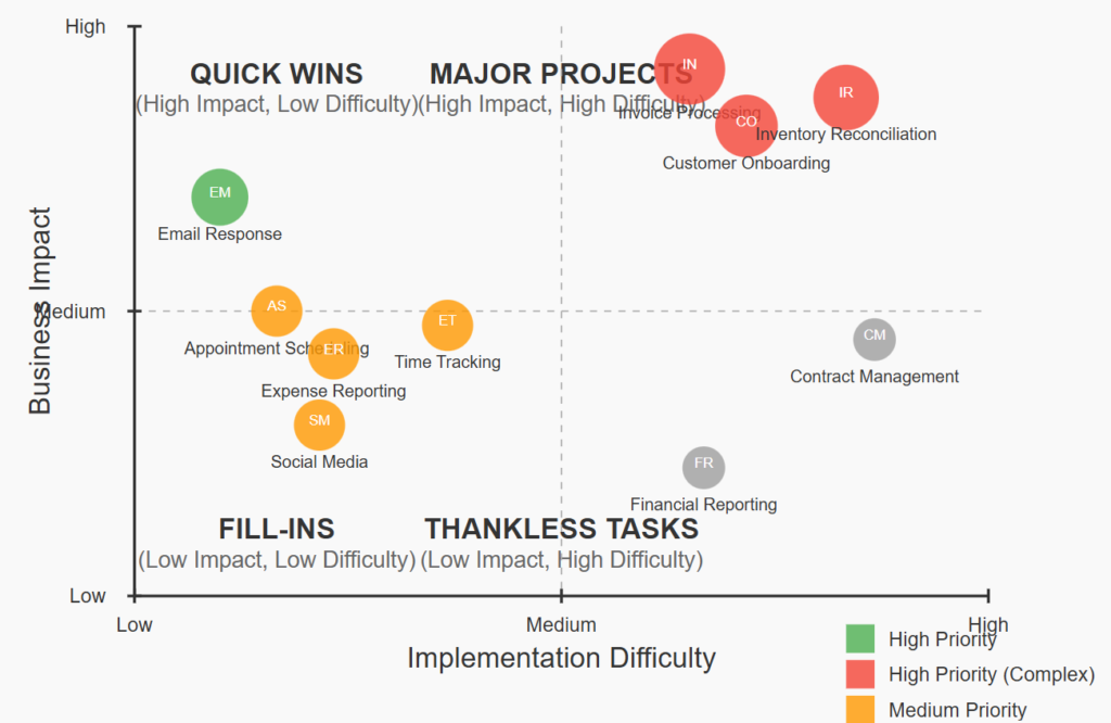
Priority Quadrant Chart:
Plot each process on a quadrant chart with:
- X-axis: Implementation difficulty (low to high).
- Y-axis: Business impact (low to high).
Circle Size: Represents the relative priority based on the combined score.
Colors:
- Green: High priority “quick wins” (high impact, low difficulty).
- Red: High priority “major projects” (high impact, high difficulty).
- Orange: Medium priority processes.
- Gray: Low priority processes.
Quadrants:
- Quick Wins: High impact, low difficulty.
- Major Projects: High impact, high difficulty.
- Fill-Ins: Medium impact, medium difficulty.
- Thankless Tasks: Low impact, high difficulty.
Sample Dataset: {Similar to the table above}
Generated result from Claude (Example):
Conclusion
It is highly recommended that you have to go to where the problem is to find out the real root cause on the ground. This is to prevent noise and unknown factors that may distort your analysis.
With a good understanding of the happenings and issues around you, you are now confident to start any automation projects.
By applying the principles outlined here—evaluating pain scores, value scores, and feasibility—you can prioritize processes that will yield the greatest benefits for your organization. This strategic approach ensures that your automation efforts are focused on high-impact areas, maximizing efficiency and reducing operational costs.
As you embark on these projects, remember to continuously monitor and adjust your strategies based on feedback and outcomes, ensuring that your automation initiatives align with your business goals and drive sustainable growth.
This conclusion reinforces the importance of understanding the context, emphasizes the strategic approach to automation, and encourages ongoing evaluation and adjustment to ensure success.